WEB ACCESSIBILITY
Goal: Redesigning the NYU Prison Education Program website according to WCAG AA guidelines for accessibility and enable better outreach of the program by incorporating good design principles for a better user experience.
ClientNYU PEPRoleWeb UX AccessibilityYear2018Linkprisoneducation.nyu.edu
My role: Used inclusive design methodology, web accessibility guidelines and user experience design process to redesign the PEP website
Duration: June 19, 2018 to August 21, 2018
Tools: Adobe Illustrator, Adobe Photoshop, Axe plugin, Wave reporter, VoiceOver, JAWS
DESIGN PROCESS
RESEARCH
General Observations
The website of the Prison Education Program needs to be redesigned in order to achieve the following:
– Better outreach
– Conformation to the standards of Web Accessibility
– Restructing content for better navigation
– Provide improved resources to people who have been released recently
– Showcase the influence of the program
Audit Report Observations
An audit was performed on the current website to discover the following areas where it needed to be remediated to ensure web accessibility:
– Content navigation: landmarks and headings
– Tab order
– WCAG compliance
– Color contrast
– Alternate text
– Purpose of links
– Accordion, Buttons, Forms, Search
USER INTERVIEW INSIGHTS
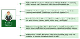
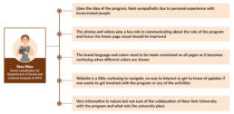
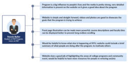
Conducted user interviews with people who were involved with the program who were either staff member or student from the program or an individual interested to get involved with the program. The insights from these users was quite useful to understand the gaps in the current website and how the navigation and content structure could be improved for better access.
PERSONA CREATION
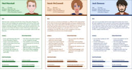
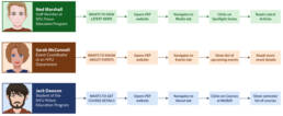
Based on the insights from the research and user interviews, three different persona were created as shown below:
JOURNEY MAP
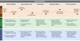
A journey map was created in order to understand the user journey in detail and analyze the pain points, opportunities, emotions and experience of the user while they navigated the current website.
CARD SORTING
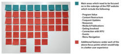
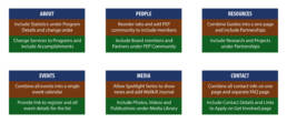
Performed the card sorting to categorize the hierarchy and priority of the topics to be included in the new website.
Current Website Flow
Analyzed and mapped the navigation flow of the current website to understand how the content was structured and to find the gaps which prevented the user from finding the right information on the website.
INFORMATION ARCHITECTURE
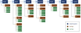
After gathering all the data received from the above steps, created the information architecture to address all the needs of the different users.
STAKEHOLDER FEEDBACK
The information architecture was shown and explained to the client, Raechel Bosch, who was the Manager of the NYU Prison Education Program. She gave feedback to each of the pages and changes were made in order to improve the structure even further.
Revised Information Architecture
Based on the feedback received from the stakeholder, the information architecture was updated as follows:
WIREFRAMES
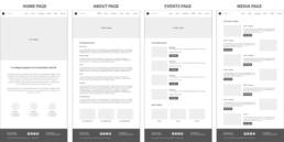
Once the information architecture was finalized, the wireframes were created by mapping existing content and deciding the layout and template of the new website.
Website Design Process
USER FLOWS
The user flows were based on the user personas created earlier and a task was assigned to each user and the flow was mapped based on how they would navigate the website.
USER TESTING
Once all the new webpages were created and the content was put onto the new website, user testing was conducted to ensure the information could be easily found by the users.
Testing for Accessibility
Every page was tested for accessibility to ensure that all content and media within the new layout of the website was according to the guidelines of WCAG for AA level of accessibility.
DESIGN ITERATION
The user testing and accessibility tests resulted in a number of issues which needed further attention and some fixes to ensure the requirements are met effectively. The iterations are summarized as given below:
FINAL DESIGN
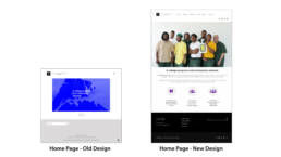
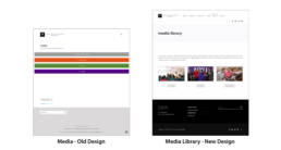
After the changes were made in the design based on the feedback received the final website was launched. Given below are some snapshots of the comparison between the old and the new website:
Results
– All content on site meets accessibility requirements as per WCAG guidelines
– New website is flexible to allow addition of more content for resources and projects
– Revised website has ensured better outreach of the program to wider target audience
– Helped to create more awareness about program on social media

