DESIGN LAB
The Design Lab is the intersection between innovation, design and technology and provides NYU students with opportunities to ideate, experiment, prototype, and build their ideas. It is the programming arm of the MakerSpace and provides a space to conduct different events and workshops on campus.
RoleUX and Spatial Design, BrandingYear2018 - 2019Linkmakerspace.engineering.nyu.edu
Design Task: To launch the Design Lab officially before the fall 2018 semester on campus to increase student interactions in the space and increase awareness about resources offered at the NYU MakerSpace.
1) Redesign of the MakerSpace website: In order to highlight the offerings of the Makerspace, a redesign of the website was needed for better user interactions. It also involved creating a promotional video to increase awareness about the MakerSpace resources.
2) Spatial design and branding of Design Lab: This included designing the Design Lab logo, graphics for the pillar art, core components, banners, merchandise and vinyl window display. It also included organizing a Design Week to involve more students in the process of design thinking and share design resources.
Team: Raksha Ravimohan, Cherisha Agarwal
Tools: Adobe Illustrator, Adobe Photoshop, Adobe Premiere Pro, Sketch, InVision, Vinyl Cutter, Laser Cutter
FINAL DELIVERABLES
PART 1) REDESIGN OF THE MAKERSPACE WEBSITE
Along with Raksha Ravimohan, I worked on the redesign of the MakerSpace website. The original website of MakerSpace was a simple blog that displayed the various machines, training calendar and funding opportunities for students but it did not highlight the information about the Design Lab and other offerings of the MakerSpace well to the viewers. Users were often unclear about the purpose of the MakerSpace and how they could utilize the space to its fullest. New viewers were not sure of the goal of the space. In order to clarify all of this, we redesigned the website to improve the experience for students and new users who want to learn about the MakerSpace and utilize its facilities.
USER RESEARCH
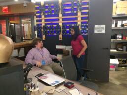
We spoke to a number of people to understand what people expected out of the MakerSpace and what needed to be improved on the website. We started off by interviewing our stakeholders to understand what their vision of the product is and what is it trying to accomplish. We also spoke to them about what their perception of the user is and the technical constraints associated with the implementation of the site. Our stakeholders included the following:
-
-
- Victoria Bill (MakerSpace Manager)
- Anne-Laure Fayard (Faculty Advisor)
- Sean Kennon (Assistant Manager)
- Teaching Assistants (MakerSpace Staff)
-
Stakeholder Insights
User Interviews
After noting down the stakeholder’s perspective about the features of the product and technical constraints, we moved on to interview some students about their experience with the site. Our initial interviews were open-ended as we tried to understand their perception of MakerSpace and the website. The goal of the user interviews was to understand the following:
-
-
-
- Why and how is the website used?
- Tasks and activities the website should support
- Goals and motivations for using the website
- Problems and frustrations with the current solution
- Pain points and thoughts on the current site
- Expectations from the website
-
-
User Group #1: NYU Students who needed to use the machines for academic work and projects, wanted to develop skills through events and workshops and were eager to go through the training and learn how to use the equipment
User Group #2: Non-NYU Guests who wanted to learn more about the space and needed to use the space for their own work, were eager to attend events and workshops open to the public and also included speaker and experts who have conducted workshops at the MakerSpace
These interviews helped us understand the frustrations faced by the users with the current website and what they expected could be improved. Based on all the information received from the interviews, we proceeded to synthesize the insights.
INSIGHTS SYNTHESIS
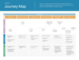
By talking to the stakeholders and users, we were able to get a good idea of the gaps in the current website and the user experience was being impacted. Thus we synthesized all the insights received from the users and created personas to map the frustrations, goals, channels and motivations of each user category. Then we proceeded to map the user journeys to understand the pain points, opportunities, thoughts and feelings of each user while they tried to access the current website.
Personas
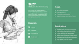
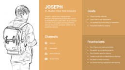
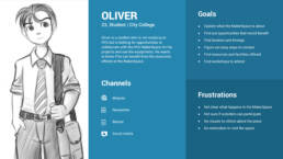
Based on our research and user interviews, we created three personas:
-
-
-
- An NYU student who primarily uses the equipment in the MakerSpace
- An NYU student who uses the website to find out about the events that are held at the MakerSpace
- A non-NYU professional who wants to know more about the resources at the MakerSpace
-
-
We identified the channels, goals and frustrations of all the 3 persona and mapped them out as follows:
Journey Mapping
The goal of creating this journey map was to analyze the user flow on the existing site and identify opportunities where the experience could be made better.
IDEATION AND BRAINSTORMING
Once we had a clear idea about the users, their workflow, needs and frustrations, we proceeded to design the solution. This step began with a basic card sorting process to analyze the different features on the website.
Card Sorting
From user interviews and stakeholder interviews, we listed the different features on sticky notes and grouped them into “Events”, “Machines” and “General”. After that, we included these points with the features of the existing site and grouped them into the same categories. This was done to combine all our gatherings and serve as a basis for the site map and information architecture.
Sitemap
From user interviews and stakeholder interviews, we listed the different features on sticky notes and grouped them into “Events”, “Machines” and “General”. After that, we included these points with the features of the existing site and grouped them into the same categories. This was done to combine all our gatherings and serve as a basis for the site map and information architecture.
Stakeholder Discussion
We presented the sitemap to our stakeholders and took them through the entire process and features that were laid out. After explaining the structure we had come up with, we also conveyed the reasoning’s behind these decisions. We also clarified few points that we were unsure of and needed their expert guidance. The feedback from the stakeholders was useful as it helped us fill some gaps, improved positions of some content and guided us to prioritize the various proposed features of the website. The discussion also helped us understand that even though stakeholders very often only worry about the end visual appeal of the product, it is important to go through the design process in detail to pick on nuances that might be missed out on otherwise. We maintained our case about creating wire frames and performing user testing even though it didn’t seem important to our stakeholders. Based on the discussion, the revised sitemap is as seen above on the right.
PROTOTYPE AND TESTING
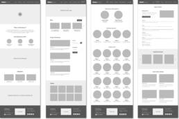
After completing the sitemap and deciding on the information architecture, we started making low fidelity wireframes for the site to create the basic framework of the website and decide on the content layout. Once this was in place, we proceeded with user testing to get feedback.
Low Fidelity Wireframes
We started making low fidelity wireframes for the site using Sketch, Illustrator and InVision. During this process, we had to look at several web design standards and what level of detail to provide on the wireframe. We were often concerned about how the site is going to be implemented and if the layout can be translated easily. So, we decided to keep the wireframe as basic as possible and concentrate only on the flow and organization of content. Here is the InVision link.
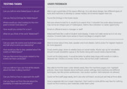
User Testing
We decided to test the wireframes on our potential users covering the 3 personas – “Student looking to attend events”, “Students who use machines”, “People outside NYU looking to collaborate or get information”.
We started off by preparing a list of tasks for the user based on our core offerings and some critical sections that were difficult to place on the site map. Since we were also in charge of developing the website, we made a list of changes based on priority (in terms of usability and implementation), so that we can get started with the pages that are confirmed.
DESIGN ITERATION
After testing the website with users and getting feedback through the various tasks, we were able to understand if the basic navigation and content structure make sense to people and if they are able to find the required information. Based on the feedback received, we came up with the following list of changes to make and then re-test the new structure.
Information Architecture
An updated information architecture was created to lay out the new changes to be made. The testing feedback was also incorporated in it and this was close to the final iteration for the navigation and content structure.
Final Implementation
After making the above changes and testing them with users, we started developing the website and incorporating the feedback to update the initial wireframes.
The MakerSpace team decided to implement the website using WordPress as it is easy for everyone to update without any code. According to NYU’s rules for accessibility, we chose an appropriate theme that is both accessible and has the features that we want. We also checked for various technical constraints such as adding plugins and custom code. We developed the website by starting off with the most important features first and simultaneously got feedback from our manager and professor.
The final site can be viewed here: http://makerspace.engineering.nyu.edu
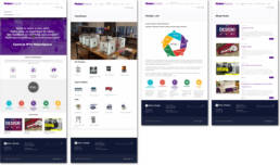
Some snapshots of the final design can be seen below:
PART 2) SPATIAL DESIGN AND BRANDING OF THE DESIGN LAB
I designed the logo for the Design Lab by initially playing around with the concept of pencil, mind map, light bulb and gears to illustrate the concept of design. But after multiple iterations decided to go ahead with a simple and minimal logo.
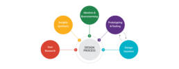
Design Thinking Process
Pillar Art
In order to motivate innovation in the MakerSpace and inspire students to create, build and make amazing projects, prototypes and designs, I worked on creating a design to showcase vinyl cut action verbs on the pillars in the space.
Core Components of Design Lab
The Design Lab is the programming arm of NYU MakerSpace. It cultivates collaboration, nurtures students’ creative confidence and encourages collaboration and connects them with other parts of the NYU Innovation and Entrepreneurship ecosystem. The Design Lab fosters a community of creative technologists, critical thinkers, and social innovators.
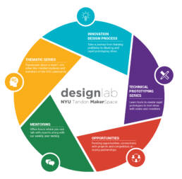
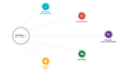
As Design Lab Coordinators, Raksha and I work to organize talks and workshops centered around design and technology. We collaborate with industry experts, create design interventions and design digital marketing and brand strategy to increase 50% student interactions in the space. In order to achieve the above, the core components of the Design Lab were designed and visually represented as shown alongside.
Window Display
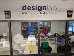
As part of the spatial design elements for the Design Lab, I designed the following visual to showcase the core components on the large window-wall in the space. This would help highlight the different features of the Design Lab to users of the space.
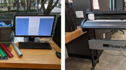
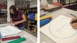
After designing the above visual, I proceeded to use the Vinyl Cutter to cut each element of the design beginning with the circular symbol for each component and then proceeding to vinyl cut the text.
Banners
To ensure better visibility of design lab upon its launch and to increase interactions, I thought it would be a good idea to map the area to a function of each of the core components. With respect to this, I designed banners as shown below to put up in different areas of the space.
Merchandise
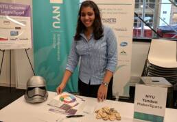
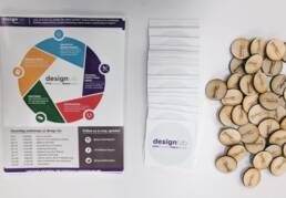
To increase awareness about the new Design Lab on campus, I designed flyers, created stickers and laser cut badges to give out during open house sessions, networking events and orientations.
Official Launch
During the 2nd anniversary of the NYU MakerSpace, the Design Lab was officially launched and we decorated the space to highlight the attention to space and received positive feedback and heartiest wishes for our hard work! It gathered the attention of a lot of students on space and we were able to better explain the goal and purpose of the Design Lab through the glass window illustration and the banners in the space.
First Design Week at NYU
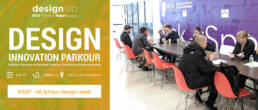
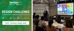
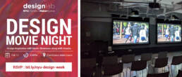
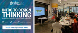
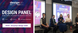
During the spring semester 2019, we organized the first-ever Design Week at the Design Lab in the NYU MakerSpace which was a great success! This series of events brought together students from various schools, programs and disciplines across NYU to learn about ideation, design, prototyping and bringing their ideas to life! Here are some highlights from the week:
Each day brought together different facets of design with different speakers and participants! It was a wonderful series of events and was very well appreciated by all the attendees! We had over 100 participants for the first-ever Design Week and the management was extremely pleased with the success of our initiative! As Design Lab Coordinators, our main responsibilities included the following:
-
-
-
-
-
- Brainstorming the different sessions, planning the series of events and the detailed agenda
- Reaching out to design experts, panellists, mentors, specialists and speakers, NYU alumni and professors
- Design promotional materials for social media and TV screens
- Create Eventbrite pages for each separate event and design certificates and flyers
- Create Design Lab Goodie Bags including customized keychains, badges and notebooks laser cut in the MakerSpace
- Order food and prototyping materials
- Rearrange space as per each event requirement
- A record participation of attendees for each event and capture photographs
-
-
-
-
Promotional Video of the MakerSpace
I worked on creating a promotional video to increase awareness about the MakerSpace resources. This video highlighted all the various machines and equipment present at the MakerSpace including 3D Printers, Laser Cutters, Othermill, WaterJet, Electrical bench testing and other Power tools. It also spoke about ways to use the MakerSpace resources and other activities, events and workshops that go on at the MakerSpace.

