SMART COLORS
We learn to develop our own perception of colors and we all associate with colors in very different ways. I am amazed with the influence and impact of colors on our actions, decisions and behaviors. This project started off with an exploration into the fascinating world of color emotions and eventually developed into a Masters’ thesis on color psychology, an interactive tool for startups and was also the topic for a TEDx talk.
RoleUX Research, Visual Design, Color PsychologyYear2018 to 2019Linkbit.ly
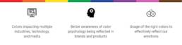
Design Statement: Design a solution to increase awareness of color psychology principles, aid better understanding of color emotions and help creatives use colors to create the right impact, keeping color accessibility in mind all along
My role: Performed extensive research and applied user-centred design principles to create an interactive, inclusive, and intelligent color tool
Duration: Sep 2018 to April 2019
Tools: Adobe Illustrator, Photoshop, InDesign, XD, After Effects, Premiere Pro, HTML, CSS, JavaScript, React, InVision
FINAL SOLUTION
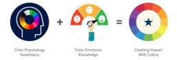
Smart Color is an intelligent and interactive color tool that helps users understand which colors are ideal to be used in certain scenarios coupled with the reasoning behind using certain colors to showcase specific outlooks and understand about color accessibility as well. This tool will help designers, creators and brands to grow their businesses and create the right appeal for their viewers, users, and customers.

INTRODUCTION
The process of creating this tool involved diving deep into color concepts to understand the psychology and emotion of each color. A data set was created to map the relation between each unique emotion to a respective color. This tool is unique as it explains the reason, significance and associations of colors in the required context, which other online color tools do not, as they only generate random color palettes. This tool will aid the understanding of color psychology principles as well as provide a customized color palette for venturing brands to create the right impression for their target users.
PHASE 1: INSPIRATION ABOUT COLOR CONCEPTS
I find it very interesting to understand the different interpretation of each color, the underlying emotion that each color evokes and how it makes us feel. My interest in this area grew when 2 years ago, I worked on a color forecasting project called ColorNext. I am also amazed at the influence of colors on our actions, decisions and behaviours.

Color Accessibility
Color accessibility is extremely important as there are about 300 million people in the world who suffer from different kinds of color blindness. This is about 4.5% of the world’s population and a very significant number of people. My research into color blindness started by looking at the causes for the deficiency, types of impairment, problems and challenges faced by colorblind people, experience with the deficiency, effect on emotions, existing solutions in the market to assist them in their daily life and work, digital and accessible solutions and possible interventions to ease the struggles faced. Thus, I decided to take an inclusive design approach in my design solution to help the users of this tool help people with color blindness.

Color in Branding
Color plays a major role in branding. A lot of brands fail because they are unable to create the right impression on customers – and those that are successful often make effective use of colors for their brand identity. While looking into branding, I learnt that a lot of brands majorly failed in their re-branding efforts and it costs them millions of dollars! The new Gap logo was ridiculed to the extent that the company brought back the old logo in just a week. Also studies reveal that a signature color can boost brand recognition by 80% as seen in the case of the Airbnb rebranding.
PHASE 2: INSIGHTS FROM RESEARCH
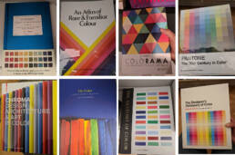
The secondary research process began by reading various journals, articles, dissertations, and performing literature review with published papers. Based on an extensive search within the NYU libraries and the New School Design Library, I found a wide collection of resources related to the topic of Color Blindness and Color Psychology. By reading reference books on color and going through published papers and online articles, I developed a strong foundation on different areas from Color Harmony to Color Perception. I also understood how each color has a fascinating story and the significance of its own.
Primary Research
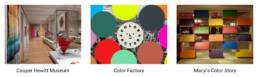
I visited the Cooper Hewitt Museum which has a wide collection of exhibits that explore the complex phenomenon of color perception. Some of the exhibits were fascinating and they helped me understand the vast world of colors in a better way. I also visited the Color Factory which recently opened in NY and consists of interactive installations to engage colors and senses. The visit to the Color Factory was extremely interesting and inspiring. I got to see assorted color installations and interactive rooms that played with various concepts of colors. I also came across the Color Story at Macy’s which is a spectral curation of products categorized by color according to the emotions they trigger when you shop, which I thought was an interesting retail approach.
Expert Insights
By speaking to different people in the industry, I received insights about the troubles color blind people encounter with digital mediums. I also learned about the influence of colors and the role of color in branding and design from creatives in the field.
User Research
When I asked people these two questions, I received a range of responses with different reasons. It was very interesting to see how people associated emotions with color!

Contextual Review
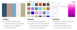
I also spent some time looking for digital products in the area of color conception. There are a couple of tools available online which generate random color palettes but while trying them out I found some significant gaps and flaws.
PHASE 3: INFLUENCING THE DESIGN PROCESS
The insights from research helped me understand the problem at hand by analyzing the emerging issues and gaps and thus establish my intent for the project and follow a user-centered design process for the solution.
Emerging Issues and Gaps
-
-
- None of the existing color tools explains why certain colors should be used in specific contexts for better impact
- There is a need for a universal color resource which helps create awareness about color emotions and color psychology
- Early brands often fail in creating the right brand identity to establish themselves in the market
- Designers often need verification and reasons for choosing color palettes
- Educational, engaging interactions will create a better understanding of color theory and style guides
-
Design Solution
I came up with the solution of smart colors which is an intelligent and interactive color tool. This tool would help establish an effective brand identity, generate brilliant color palettes, explain usage of color psychology and encourage the use of accessible colors. Some other key characteristics are as follows:
-
-
-
- Wide Usability: Can be used by designers, color blind people, business owners
- Creates Awareness: Educates people about the reasons behind color influences
- Custom Branding Guide: Provides customized non-random color palettes with specific rationales
-
-

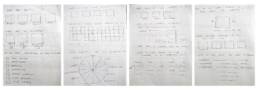
Initial Sketch
Here is an initial sketch which lays out the foundation of the 3 step process.

Prototype 1.0: Paper Prototype
I proceeded to create a paper prototype which explored in more detail the process to receive input about user preferences and requirement by asking questions about the industry, company vision and so on.
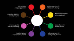
Color Data Set
Next, I created a data set by selecting ten color buckets and listing words and emotions associated with the energy of each color. After going through a set of trusted resources and established references, I synthesizing my findings and prioritized the words which were reoccurring and mapped them to each color.
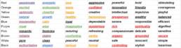
Next, I created a set of ten shades for each color bucket and mapped one unique word to each shade. Thus this process resulted in a data set of 100 colors and 100 words which would form the base for the working of the tool and help validate the results.

Prototype 2.0 – Clickable Version
For the clickable prototype, I created the flow for a restaurant-style guide and created a sample results page to test if the flow made sense to users. This prototype included three questions which allowed the tool to understand user requirements.
Clickable Prototype: https://projects.invisionapp.com/share/3XR5995JTRG#/353708088_Prototype-01

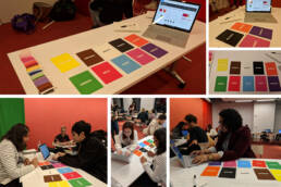
User Testing
During user testing, I got some very interesting insights and encouraging feedback which helped iterate on the design and improve the existing gaps. Some of the feedback I received was as follows:
-
-
-
-
- There is a lot of potential with this tool and the flow makes complete sense as it helped me understand more about color psychology
- Cultural context is very interesting to learn about as a designer even it is not for an international brand
- Might be a good idea to stick to only digital formats for the 1st version
- Color accessibility details should be included on the main results page
-
-
-
User Feedback
The complete user feedback has been recorded and can be viewed here: https://drive.google.com/file/d/1J1I_OWDBPSkCOX-XaKYfDeBirYdA4N8C/view?usp=sharing
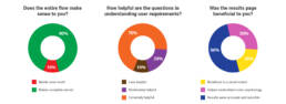
Some statistics of the user feedback received were as follows – 90% users felt the flow made sense, 70% of users found the questions to be helpful and 80% users found the results page to be beneficial in some way.
User Validation
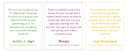
I also spoke to experts in the field and tested my prototype concepts with them. Jordan, the Director at Dynamichrome validated the need for this tool. Shweta who is a color strategist and psychologist said there is a definite need in the market for this concept. Leah, the Creative Director at Color Factory agreed that it has a lot of potential for a variety of users.
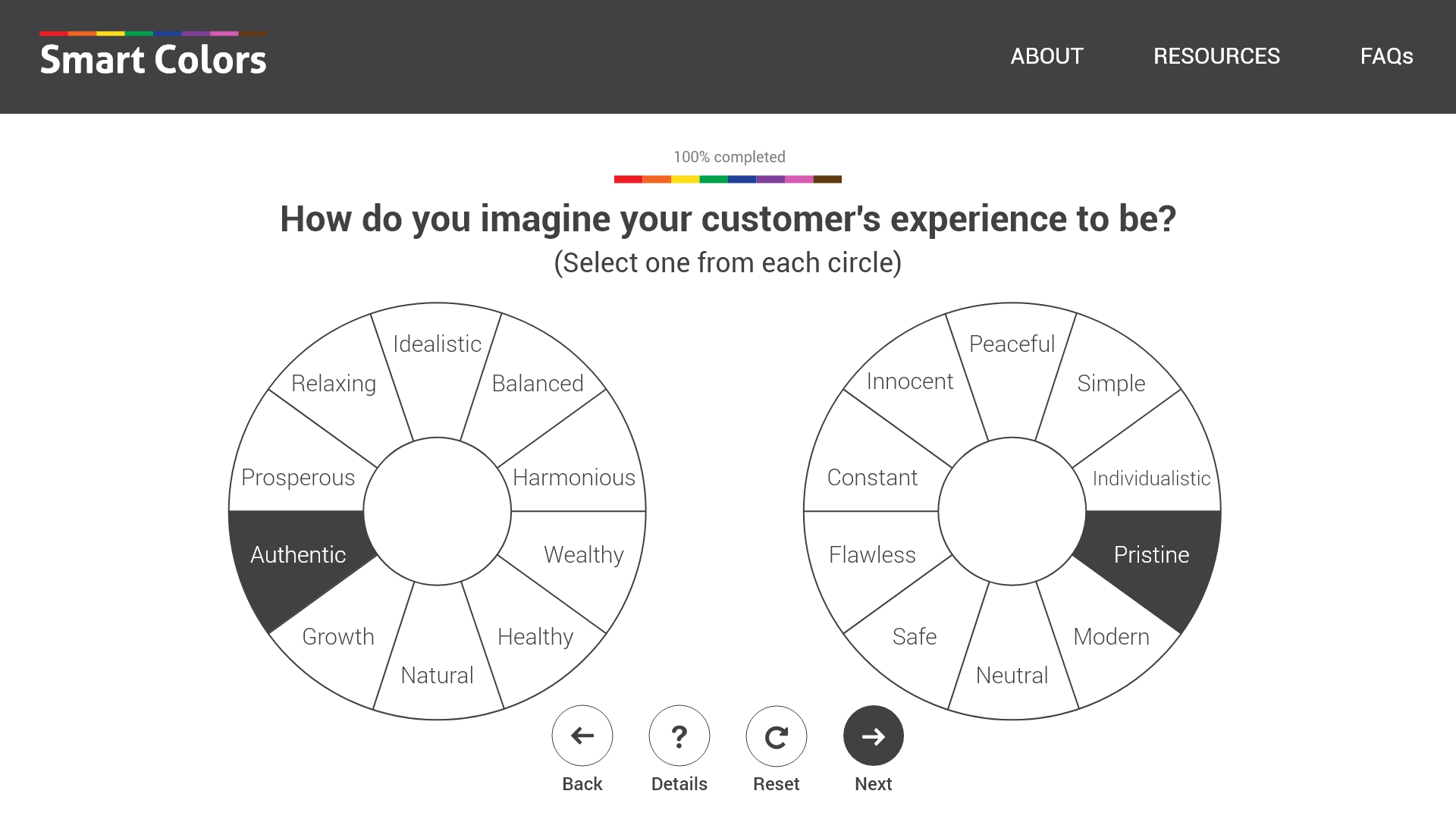
Programmed Flow
Next, I programmed the logic for the flow by creating web pages and providing the data set as the main database of the code. The technical components included using React as the main framework along with Javascript Version 6 and Parcel application bundler. The algorithm allowed the user to choose two options for the first two questions and resulted in generating the exact shades of the color, the swatch and the name. As we can see here, the tool allows you to choose any two options for each question and shows the respective colors. You can go back and change your choices and see two new colors generated.
Prototype 3.0 – Working Product
For the final prototype, I iterated on the earlier prototype screens to make the flow more streamlined, included more features and made it dynamic by allowing the user to generate different results based on the selected input.


PHASE 4: IMPACT OF THE CONCEPT
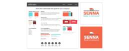
This prototype was a success and I used this concept with startups. Here is a successful case where the tool helped the company create their brand identity and logo. Senna is a Retail Startup which aims to provide quick and seamless delivery. The owner was extremely happy with the end result and the company has started to receive good recognition in the market.
Success Stories
Here are a couple of other similar success stories where the tool was used for Hardy Capital, a Finance Startup and Novelty Interactive, an Education Startup and the companies were extremely satisfied with the color palettes.

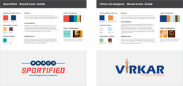
The concept of the tool was also used in establishing the brand identity of startups like Sportified, a sports academy and established companies like Virkar Developers, a real estate and construction company. The proposed color guide was much appreciated by the owners and influenced all their social media marketing and website design efforts.
Final Results

Next Steps
-
-
-
- Map out the results for all the ten industries and then for other sub-industries as well
- Figure out the development scenario and logic for the entire working of the tool
- Include an option to see customized color palettes for print work as well
- Give font recommendations and provide text accessibility as well
- Show examples of websites, locations and products for better relation to color palettes
- Try mapping multiple adjectives into one word so there is more depth of the analysis
- Allow the user to be able to accommodate using an existing logo or website
- Continue testing with more companies and individuals for concrete feedback
-
-
Final Deliverables
Working Prototype: https://xd.adobe.com/view/ce029541-b8ff-413d-4b77-01bef4f08dcd-b833/
Thesis Defense Presentation: https://docs.google.com/presentation/d/1gN_WpE5VSrY4c081XeMlYT5pv1XhPzXUV0FkVBDVFNk/edit?usp=sharing
Thesis Paper: Cherisha Agarwal_IDM MS Thesis Spring 19_Thesis Paper.pdf
TEDx Talk
I also got a chance to deliver a TEDx talk on this concept of Smart Colors and the talk was very well received as a lot of people were very intrigued by this application of color psychology.
Presentation: https://docs.google.com/presentation/d/1oWw8lT416pLi6Mgnf7R8ECEtrXyTH8ZUoankIsxm8sA/edit
