RC WEBSITE DESIGN
ReactiveCore is a tech firm that is focused on automating healthcare solutions using a platform backed by data science, ontologies and decision intelligence. The company website was outdated in terms of content, design style and usability. By using an end-to-end human centered design process, I put together a modern, clean and visually appealing website design that would enhance the brand identity and help the company make a better impression to their target audience in the market.
RoleUX Research, Visual Design, BrandingYearMay to July 2020Linkreactivecore.com
GOAL OF REDESIGN EFFORT

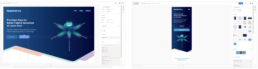
FINAL SOLUTION

DESIGN PROCESS

STEP 1 - RESEARCH
The research phase began with an analysis of current website to understand the previous website design layout, effort, and intent
First Impressions of current website
● Language is too technical, complicated
● Looks like a cybersecurity firm!
● Government war room impression
● Gives a rich villain company vibe
● No clear structure or message
● Boring! Not compelling at all!
● Content is muddled and confusing!
● Need better graphics & pictures
Current score based on principles of web design: 2/10
✓ Responsive and Mobile friendly
✓ Easy navigation and fast loading
✘ Less is more – Keeping it simple
✘ Innovative but not distracting
✘ Visual Hierarchy and Accessibility
✘ Aesthetically appealing to the right users
✘ Consistent, Engaging, Intuitive
✘ Easy to understand and inspiring to go deeper
✘ Visual elements placed to focus user attention
✘ Emphasis on what matters most
Feedback from expert analysts
Performing analysis of the feedback received from industry experts
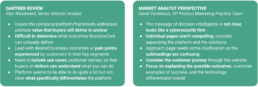
Competitive Analysis


Datavant – Is a good reference in terms of content and style
Ontotext – Don’t like visual style, it’s too much and not appealing to us right now
Tiger Graph – Is engaging, looks good, structure is in place, some styles are nice
Flexrule – Not appealing, business rules page is too much, too technical
Klue – Animations and motion graphics are a bad idea when they reduce page load time
Cambridge semantics – Products page detailed info is needed on a secondary page
Noodle.ai – Motion graphic around enterprise.ai is an inspiring reference
Prowler.io – Parallax effect is too much, it will grow old, does not serve our purpose
Maana – Video is needed, metrics and scientific representation would be good
Stardog – Interesting tagline, icons are nice and main visual good reference point
Datarobot – Structure of content is good, graphic at the bottom is interesting
Stakeholder and User Interviews
Conducting user interviews for feedback on current site, understanding of objectives, brand attributes and expectations from stakeholders
Insights from User Interviews (Internal Company Employees)
Requirements from Stakeholders (Product Managers, Sales and Marketing Leads, Client Engagement Partners)
● Website should help user from a business perspective and help figure out solutions
● Screens should have some simple business points that drill you in and click for more technical supporting details
● Need an analogy to explain and visualize our core differentiators and also need real examples to illustrate industry terms like AI, ML, etc
● Highlight our identity about being oriented for business solutions and enable people to understand key components of the platform
● Include interactive features like free trial, engaging videos, revenue calculator, webinars
● Come up with a simple new design that gets out the concepts that we have right now and get them interested so they contact us
STEP 2 - IDEATION
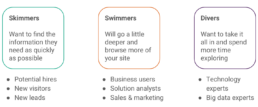
Persona Creation
Identification of target user personas and listing the channels, goals, motivations and frustrations of each user
User Categories


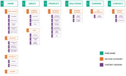
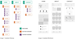
Sitemap Discussion
Mapping and analysis of the current website flow, identifying changes to make, and selecting new features and sections to be included
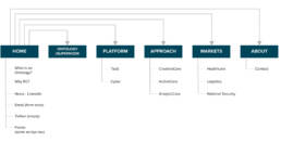
Changes to make in current sitemap
I decided to make the following changes in the sitemap based on current industry standards and to address the goal of the redesign:
● Strong tagline, introduction video, and latest news is needed along with better pictures and visuals
● Who we are, why choose us and about page should be improved
● Twitter, ontology supernode, 3 cores innovation should be removed
● Footer should have address, key info of company, location, and how to contact – social media not needed but LinkedIn page link needed
● Landing page should have two main sections:
○ Solutions (Healthcare, life science, business, product, success stories)
○ Technology (Decision intelligence, Knowledge graph, Platform architecture, open source stack, capabilities)
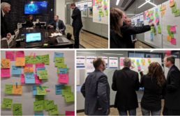
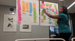
Affinity Mapping
An affinity mapping exercise was conducted in person with the Product Manager, Sales Lead, Marketing Analyst and Chief of Design Innovation of the company to figure out the landing page layout and content to be included.
Insights for Landing Page
● Start with tagline and hook – scalable knowledge graph and decision intelligence and include quick links with a catchy background visual
● Showcase 3 key technical features and advantages, include client testimonials for credibility along with market based solutions
● Video overview of RC + vision + recent news
● Request to follow up – Learn More, Request Demo
● Identity for RC – visualization, colors, consistency
● High level keywords, minimal and compelling text, hover for more details
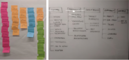
Insights Synthesis
Creating new sitemap by capturing stakeholder feedback, finalization of information architecture
STEP 3 - DESIGN
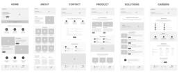
Low Fidelity Wireframes
Creating low fidelity wireframe from the information architecture to fix on structure, layout and navigation flow
Stakeholder Feedback
Incorporating stakeholder feedback on the wireframes, making changes in the sitemap and updating the wireframes
High Fidelity Prototype
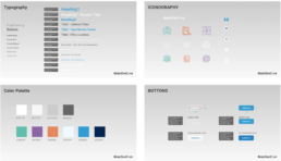
Applying visual design treatment and brand colors to the wireframes, creating a high fidelity clickable prototype, receiving feedback on content and graphics. The main areas that were focused on to get the visual designs in place were as follows:
● Laying out finalized content and mapping navigation flow
● Color palette and design theme to be consistent with the brand language
● Iconography, visual assets and cosmetic treatment
● Header background visuals and other high quality images
● User interface components including buttons and form fields
Image Selection

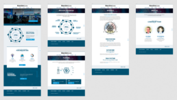
Visual Mock-up of Final Design
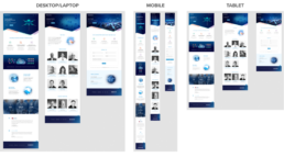
The final designs for different screens can be seen above. Final website can be viewed here: https://reactivecore.com/
STEP 4 - TESTING
Design Hand-off
Finalize content, visualizations, imagery and styles and handing off style guide and final design to development team for implementation
Translation of Design to Code (using Adobe XD)
Internal User Testing
Performing testing with internal users to test navigation execution and content review

Acceptance Testing
Perform acceptance testing to ensure developed site matches the design, content review, spell check, web accessibility test, responsiveness across different devices
Accessibility Test (Voiceover, Wave)

Responsiveness Test

Visual and Content Updates

Changes made after user testing
1. Not evident that logo takes to home page – added home to navigation menu
2. Contact form too small – increased size
3. Paragraph font too light – font weight was increased
4. After scrolling down, there is no direct way to get back up – Above footer, arrow added to enable
scrolling back to the top
5. Micro-interactions were added in the form of simple animations to increase engagement
6. Content changes were made to different sections and bios
7. Visual fixes were made to the layout on all the pages to match the design
8. Alt text was added to all images and heading hierarchy established for accessibility
External User Testing
Perform testing with external users to test if the content and flow makes sense


Feedback from Users
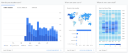
Website Analytics

Next Steps based on User Feedback
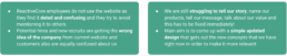
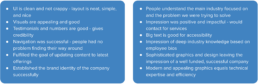
1. Video or demo outlining the workflow is missing – add step by step introduction
2. Example use cases of healthcare data and AI technology is missing – include solutions, product offerings, platform details, differentiators, case studies, proof of concept papers, more clients
3. Proof of success in terms of clients, revenue, and success stories is not clear – clarify better
4. Not clear what IDNames.Services is! – everyone mentioned this, needs to be fixed
5. A very simple graphic illustration of Reactivecore’s function and “end product” potential as well as a look at what might happen without Reactivecore’s service – include a motion graphic video to explain the process and value
6. The term ‘Precision Data’ is not well known or understandable – Include more explanation for it
Links
1. Website link: https://reactivecore.com/
2. XD design: https://xd.adobe.com/view/6bec91d0-0765-4cd2-bbea-f9e7823f1488-3ebf/
3. Style guide: https://xd.adobe.com/view/43d560ca-57d7-4e66-9660-c891ccb52950-1686/